is the world cup good for brazil?
You have been given a task sheet to work from in order to answer the enquiry question above! Some suggestions as to how to complete this enquiry using the iPad have been given on the task sheet. The information below is additional ideas that you may want to consider when completing your work!
1. Where is & What is Brazil like?
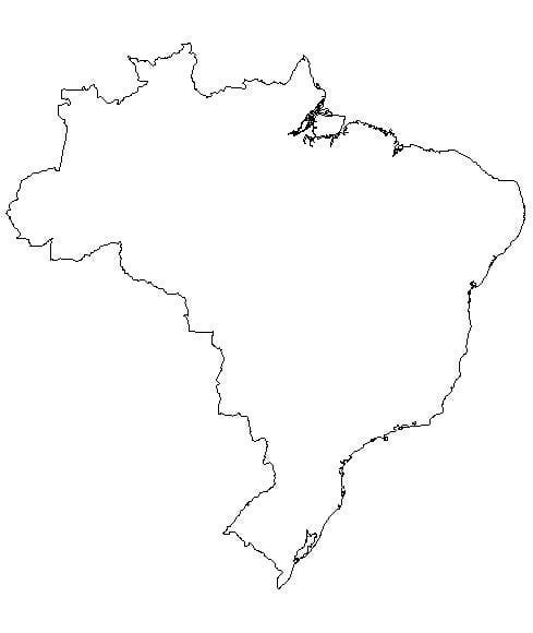
You must include here maps that outline the main geographical features of Brazil. You could find a map online and annotate accordingly with important information such as rivers, settlements, equator and rainforests. A simple map is available from the download below if you need it!
You must include here maps that outline the main geographical features of Brazil. You could find a map online and annotate accordingly with important information such as rivers, settlements, equator and rainforests. A simple map is available from the download below if you need it!
To show what Brazil is like you should use the resources QR code on the task sheet that takes you to the PADLET wall of resources. Watch the videos. You could then make a description using these videos of Brazils cities, carnivals, the Pantanal and the Amzon Rainforest. You may want to produce a guide on the best time to visit Brazil and provide any top tips for travelers to the country? Another idea could be to create a one sided fact sheet about any one of the areas/places mentioned in any of the videos on the PADLET wall? You should include images, maps and make references to human and physical attractions too if you choose to do this! Remember to be inovative and use lots of the apps suggested on the task sheet to produce this section!
2. Who is going to Brazil 2014?
In this section you should try to find out which countries will be participating in the 2014 World Cup in Brazil and to find if there is a relationship between qualifiers and how rich and healthy each country is. This link takes you to the Official FIFA site and an interactive map that shows you the participating countries in the 2014 World Cup.
You should consider using a blank map (there is one available by clicking below) and shade in as well as carefully labelling the participating countries (the link to FIFA above will help) using a colour scheme. An example shading system could be:
- North America - Red
- South America - Green
- Europe - Blue
- Africa - Yellow
- Asia* - Orange
- Oceania - None Qualified
* You will see that Australia play in the Asia group of footballing countries and not in Oceania, where they are actually
located!
3. Is footbal a rich mans game?
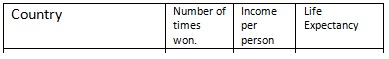
There are many ways to show an answer to this as a geographer. You need to consider using either Gapminder World, a really excellent tool for Geography used for looking at key data of countries, or an atlas (hand held or maybe use the CIA Worldfactbook on your iPad. We are going to look at two bits of data for each of the previous winners of the Football World Cup.
a) Life Expectancy - This is the average age to which people live to in a country. A high life expectancy would indicate that people
are generally healthy and well looked after. A low life expectancy would mean health is generally poor and hospitals may not be available to everyone.
b) Income Per Person - This means the average annual (every year) income of a typical person who lives in that country
in US $. A high annual income would indicate better jobs and employment possibilities and the opposite for a low income. In France, the average income per year is $43,000 at present.
If you are using the Gapminder World site you should follow these instructions:
a. From the menu on the right hand side, select the countries that have won the world cup previously. To find a list of these countries click here (for England, you'll need to select United Kingdom).
b. At the bottom right corner, pull the 'Opacity Slider' to the left so that all the other world countries don't show up.
c. Now click on play and watch what happens.
Movement to the right indicates your country getting richer, movement upwards indicates people living to an older age. If the bubble gets bigger, that is because population has increased (more people) too.
If you are using other methods then a graph using either numbers on the iPad or equivalent that sees you plot life expectancy against GNP should be done.
Once you have done either of these you should either take a screen shot of the finished graph or inport your numbers graph into your presentation. You must also include a table that shows the information below.
You should then consider answering the following questions with explanations that demonstrate your understanding.
1 Name the regions of the world that have not had a World Cup winner so far.
2 Which region seems to dominate the World Cup winners (orange)?
3 How many times have countries from this region won the World Cup?
4 What has happened to income per person and life expectancy in these countries over the last 200 years?
5 How many times have countries from the other world region won the World Cup?
6 Which country is the most successful?
7 What has happened to income per person and life expectancy in these three countries over the last 200 years?
8 What is the income per person and life expectancy gap between the most successful country from each of the two regions?
Finally you should give an answer that concludes thi ssection. A good example question to answer in detail could be:
Is there a relationship between the health and wealth of a country and their ability to win the World Cup?
4. How are big brands used at the world cup - is it globalisation?
In this part of your enquiry you are going to find out how global brands also take part in the World Cup. Look at this link click here to be taken to the FIFA marketing page where each of the sponsors operating at the world cup 2014 are listed.
Using the help statements and the videos from the PADLET wall showing 6 of major sponsors operating at the 2014 World cup ,you must produce a report taking one of the options below as your stand point.
Option 1 - I think that advertising by big business is really clever and important during the World Cup and allows people access to buy some excellent products. If they didn't advertise, someone else would.
Option 2 - I think that advertising by big business might try to exploit the country during the World Cup. Not many of these brands are Brazilian and so where does the profit go to?
Use the help sheet below to help you to include important information to back up your viewpoint.
